Avital Glibicky
BeMe
MY ROLE
As the sole Visual and UX Designer on this project, I was responsible for designing the digital platform and branding for BeMe. My role encompassed user experience strategy, visual design, and interaction design, ensuring a cohesive and engaging interface that promotes mindfulness, fitness, and social engagement for college students. I developed the information architecture, wireframes, and high-fidelity prototypes, while also crafting the brand identity and visual language to align with BeMe’s mission.
TARGET AUDIENCE
BeMe is an organization that works in partnership with colleges across the United States to provide students with support and resources to lead healthy and active lives.
BACKGROUND
College is the time to explore yourself and we are here to facilitate your mental and physical health. We are dedicated to connecting students with similar interests to keep each other motivated in the ultimate goal to stay healthy.
DESIGN PROBLEM
Create a digital platform and brand that works with colleges to give students the space to meditate, work out, and engage with others.
DESIGN PROCESS
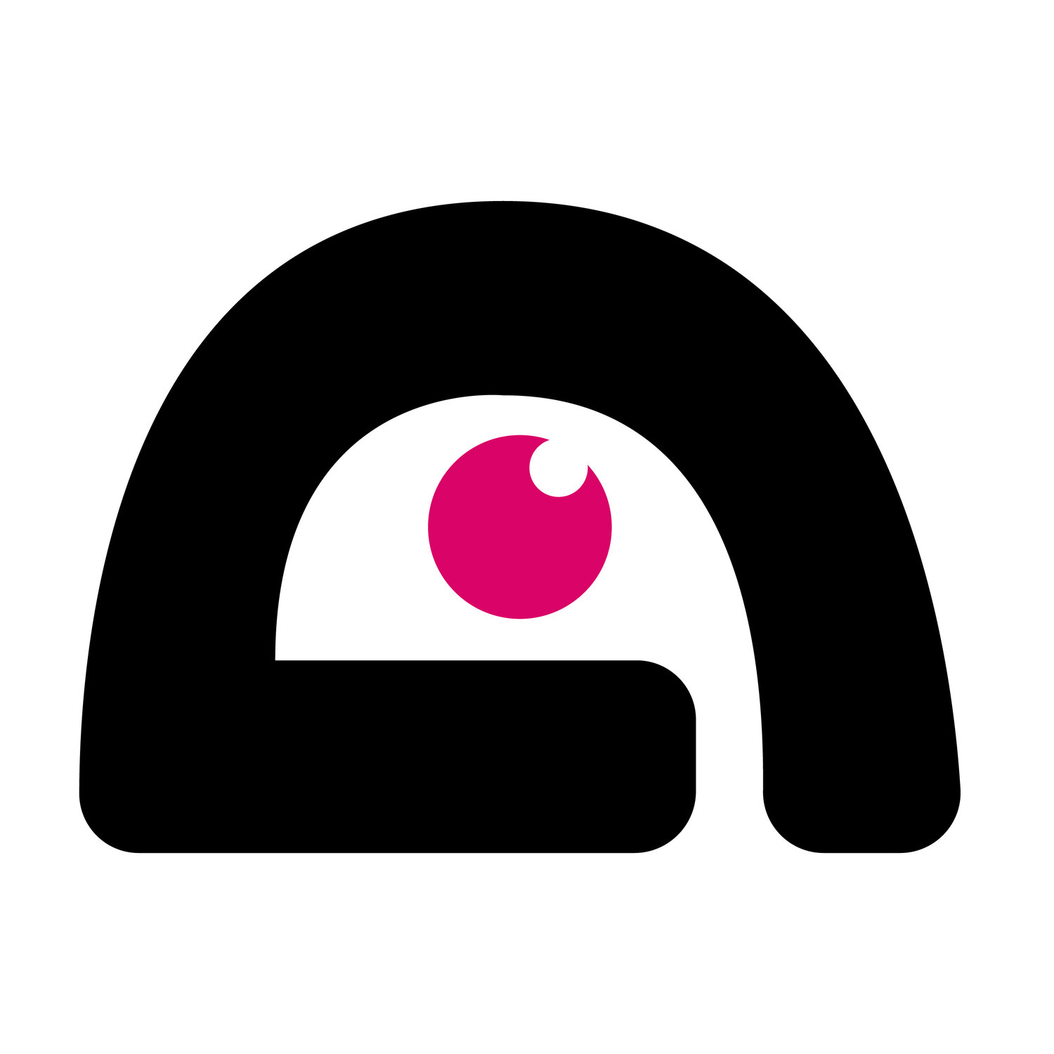
Originally, a symbol was meant to represent the brand, but the name BeMe stood apart as uniquely capable the various sectors of the brand including, Mindfulness, Fitness, and Teams. Grids were implemented throughout for a clean and sleek design.
DESIGN SOLUTION
We introduce group and solo exercise as well as mindfulness activities for college students who want a balanced lifestyle.
DESIGN CHALLENGES & CONSTRAINTS
Due to time constraints, I was unable to conduct extensive user interviews or usability testing before finalizing key design decisions. Instead, I relied on secondary research and assumptions about student needs.
Balancing Simplicity & Engagement
The design needed to feel clean and intuitive while also being engaging and motivating for students. Finding the right balance between an aesthetic, structured layout (grids) and an inviting, energetic feel was a challenge.
Brand Identity Alignment
Originally, the brand was meant to be represented by a symbol, but as the project evolved, it became clear that the name BeMe itself held stronger branding potential. Adapting the visual identity to reflect this shift while maintaining consistency was a key challenge.
Creating a Scalable Design System
The platform needed to accommodate multiple focus areas (Mindfulness, Fitness, and Teams) without overwhelming users. Designing a modular and adaptable UI that worked across different experiences was crucial.
Ensuring Accessibility & Usability
Given the diverse range of students using the platform, accessibility was a consideration, but without formal accessibility testing, I had to rely on best practices to ensure usability for all students.
Technical & Development Constraints
Since I worked solely on the UX/UI design, this meant ensuring my designs were feasible within the given technical constraints, keeping interactions intuitive yet implementable.
LESSONS LEARNED
Designing for Multiple User Journeys – Creating a platform that supports both solo and group activities required me to think critically about navigation flows and interaction design to ensure a seamless experience.
The Power of Visual Hierarchy – Implementing grids and structured layouts taught me how to maintain clarity and consistency while allowing room for visual engagement.
Strategic Prioritization in UX – With limited user research and testing time, I learned to prioritize key features and usability heuristics, ensuring the most critical user interactions were intuitive.
Flexibility in Design Execution – Constraints in time and technical feasibility pushed me to be more efficient in decision-making, focusing on practical solutions rather than ideal scenarios.
The Importance of Documentation – Clearly annotating design decisions for developers and stakeholders made it easier to communicate functionality and ensure smooth handoff.
SOFTWARE
Adobe XD | Illustrator
Sticker Sheet / Design Kit

Branding / Marketing
Example Digital Wireframes for Desktop Size


Example Digital Wireframes for Mobile Size


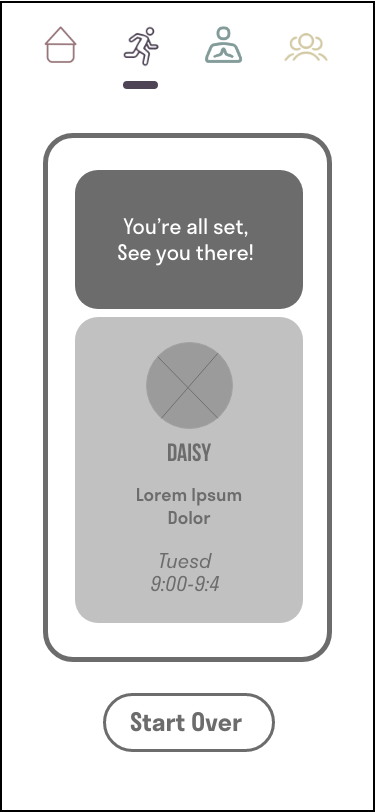
Digital and Mobile Walkthroughs


